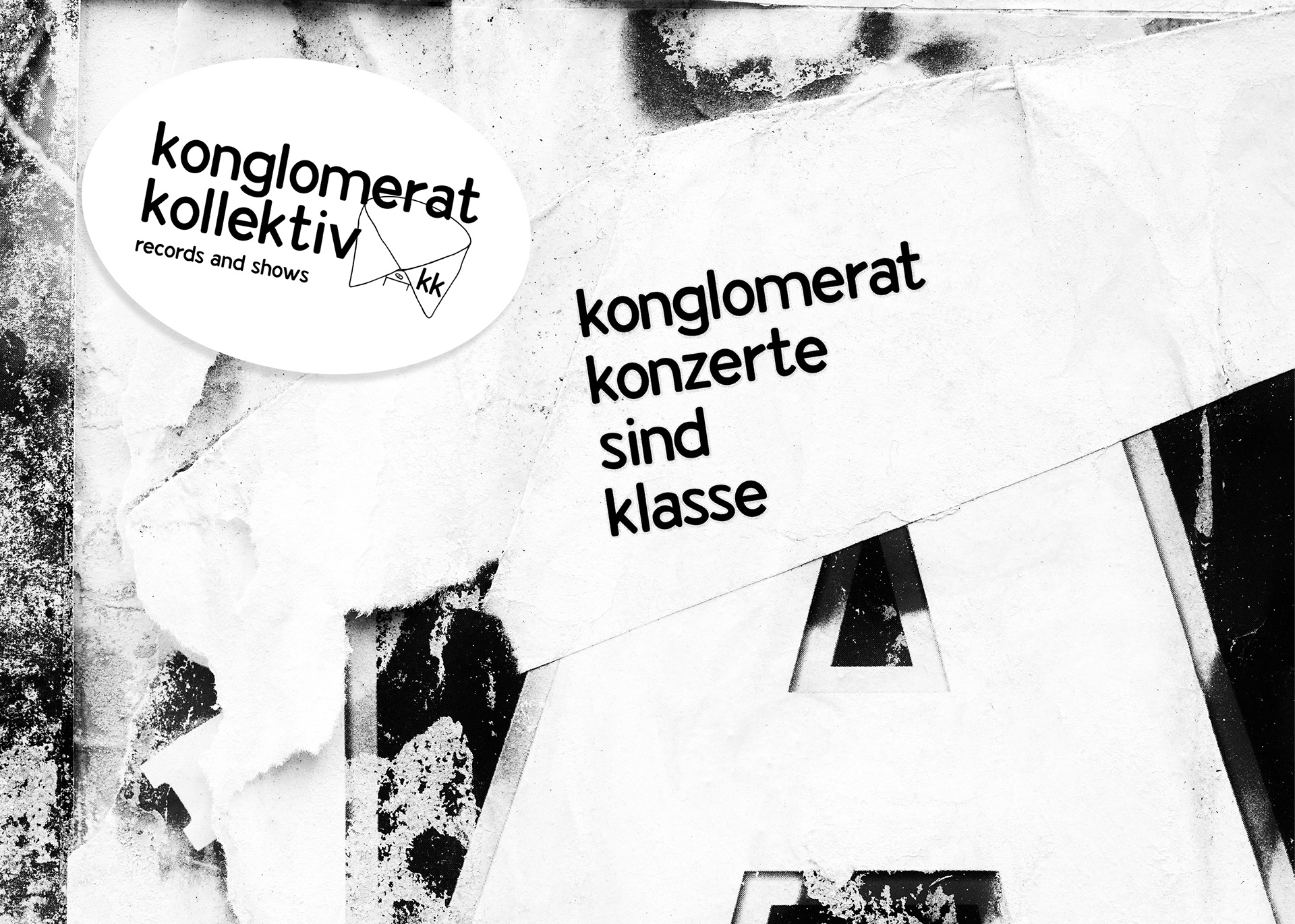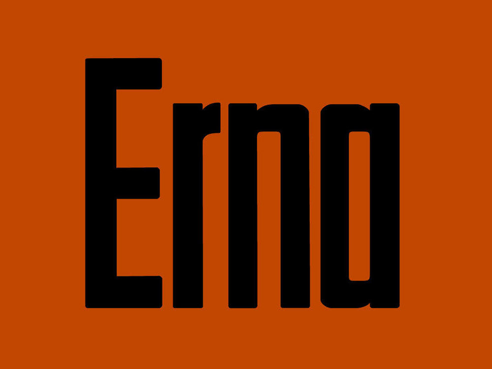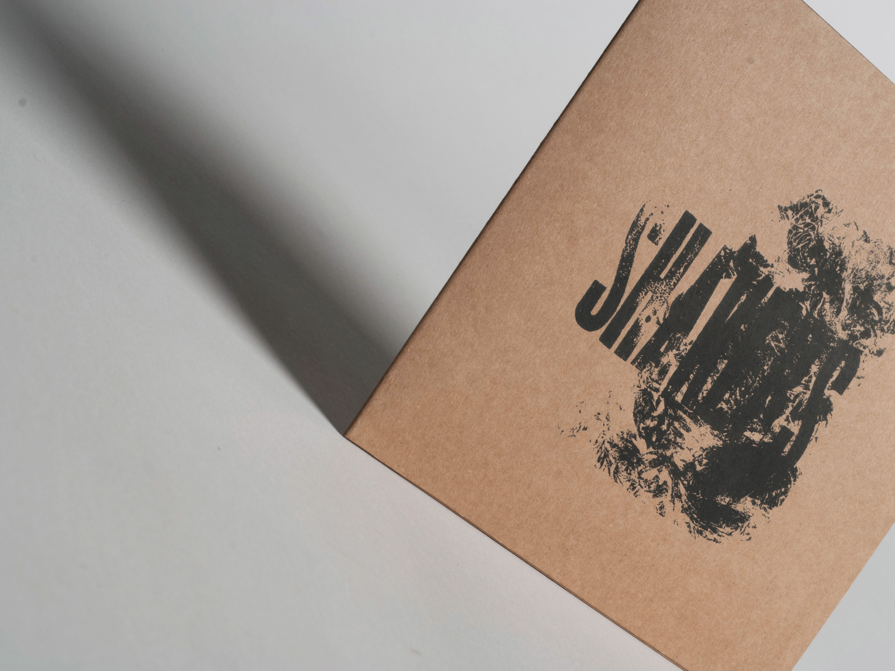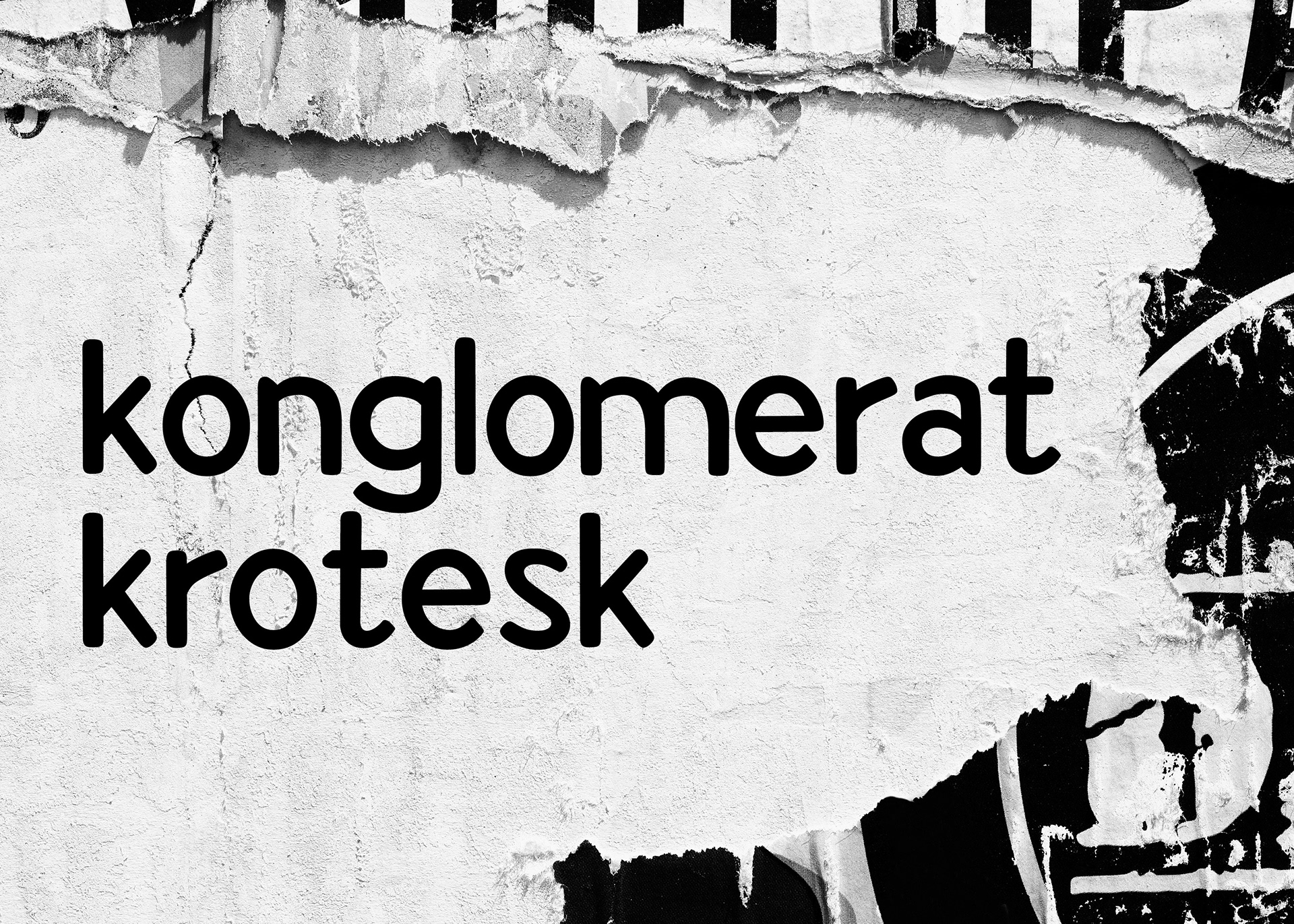
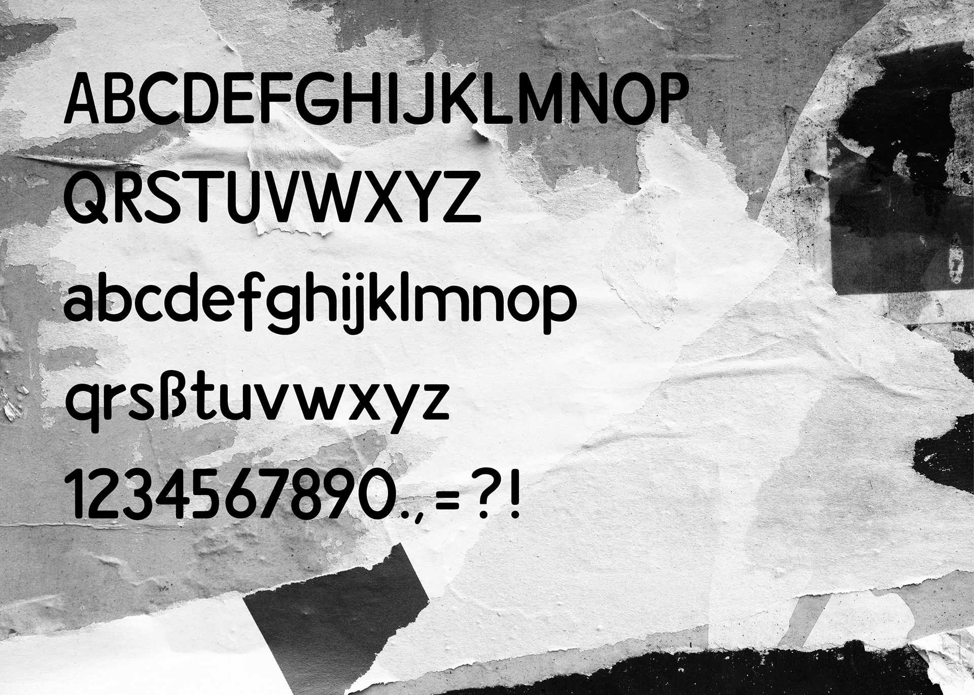
Which started with a type design workshop and the assigned attribute “cheap” turned out to become a rounded grotesque Antiqua and the house typeface for the DIY punk show and record label konglomerat kollektiv.
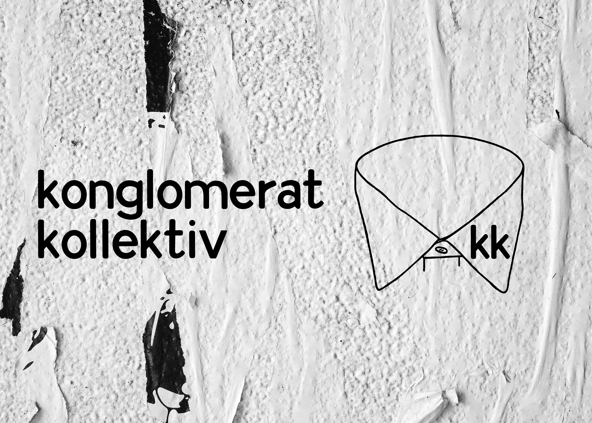
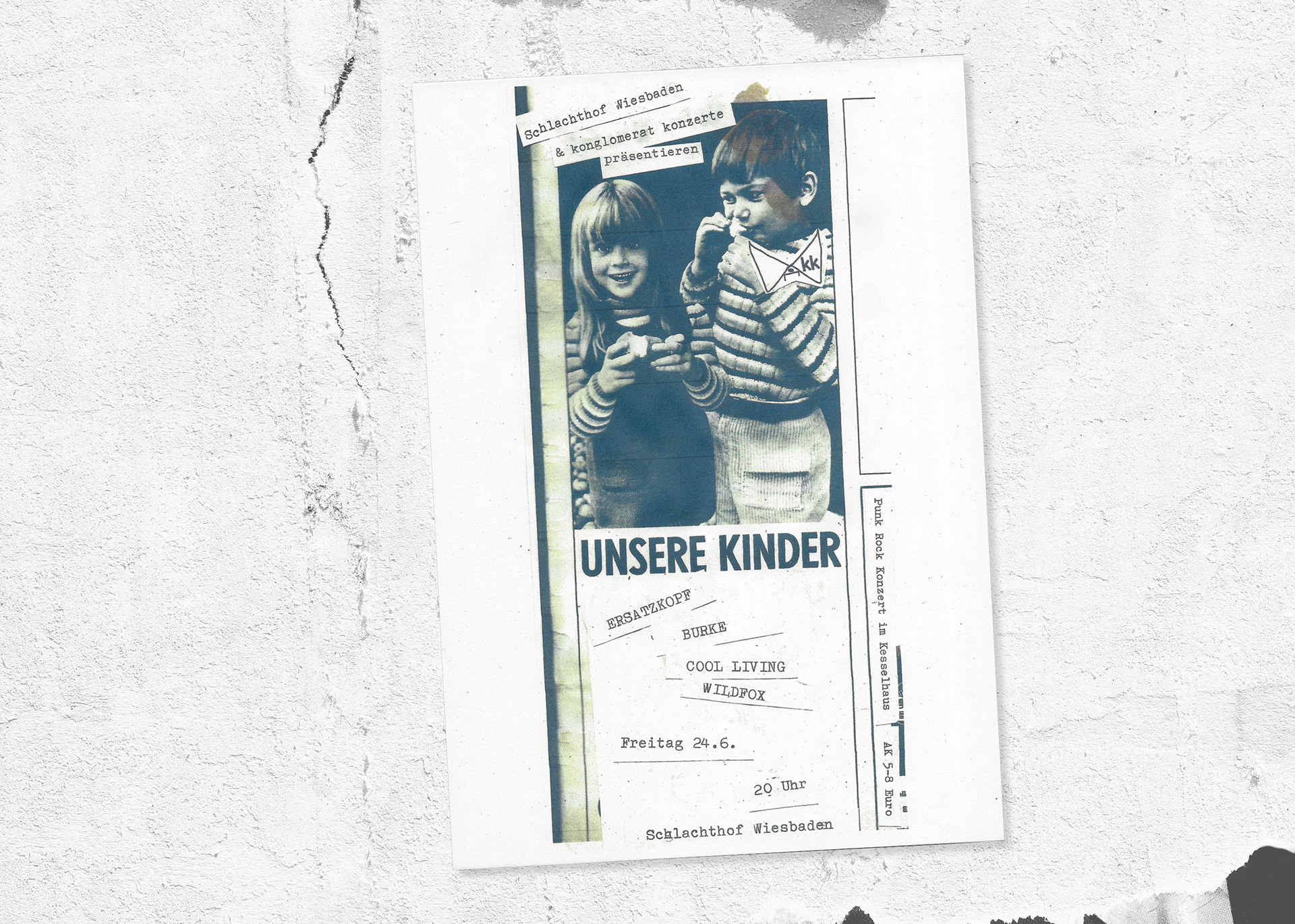
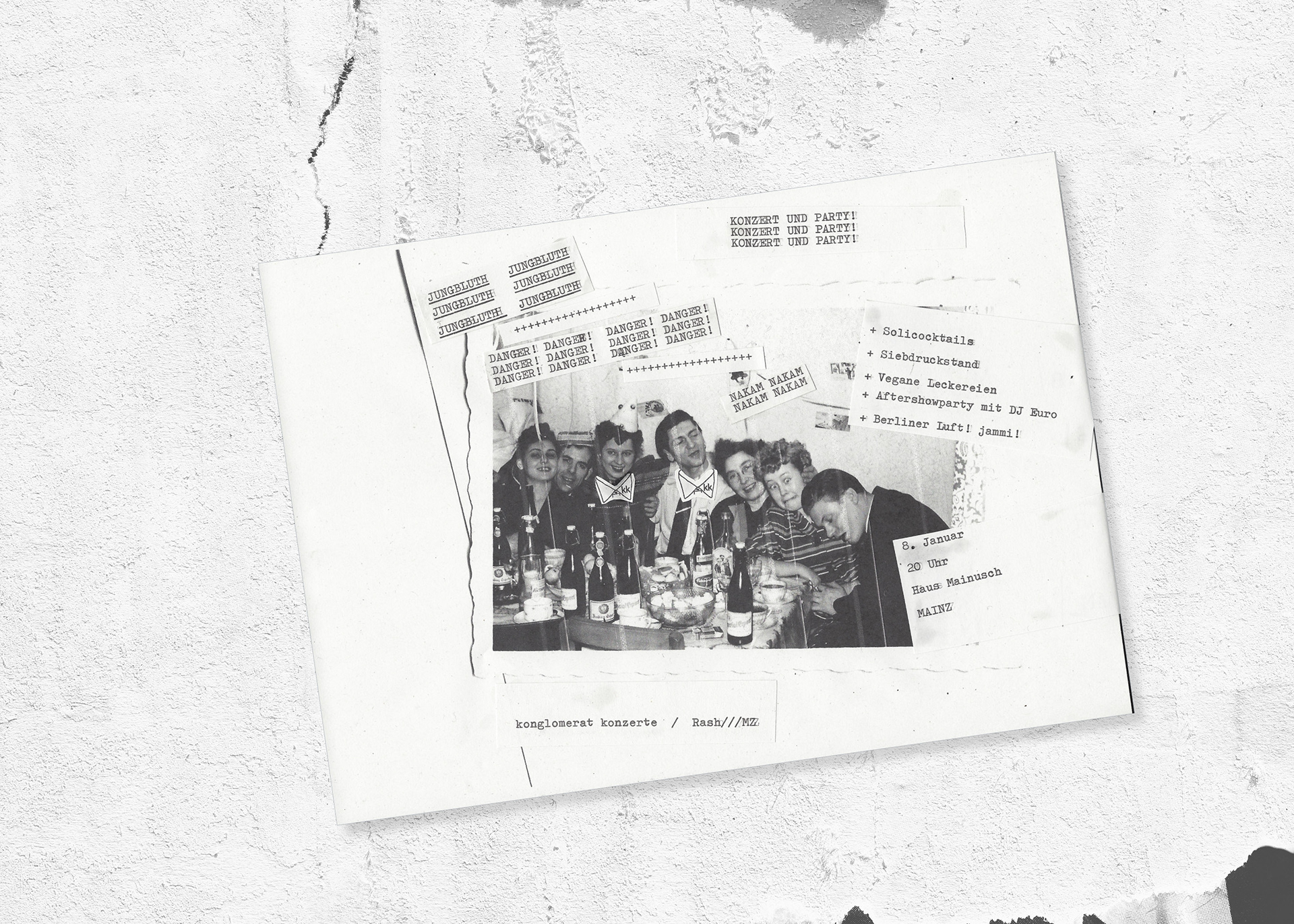
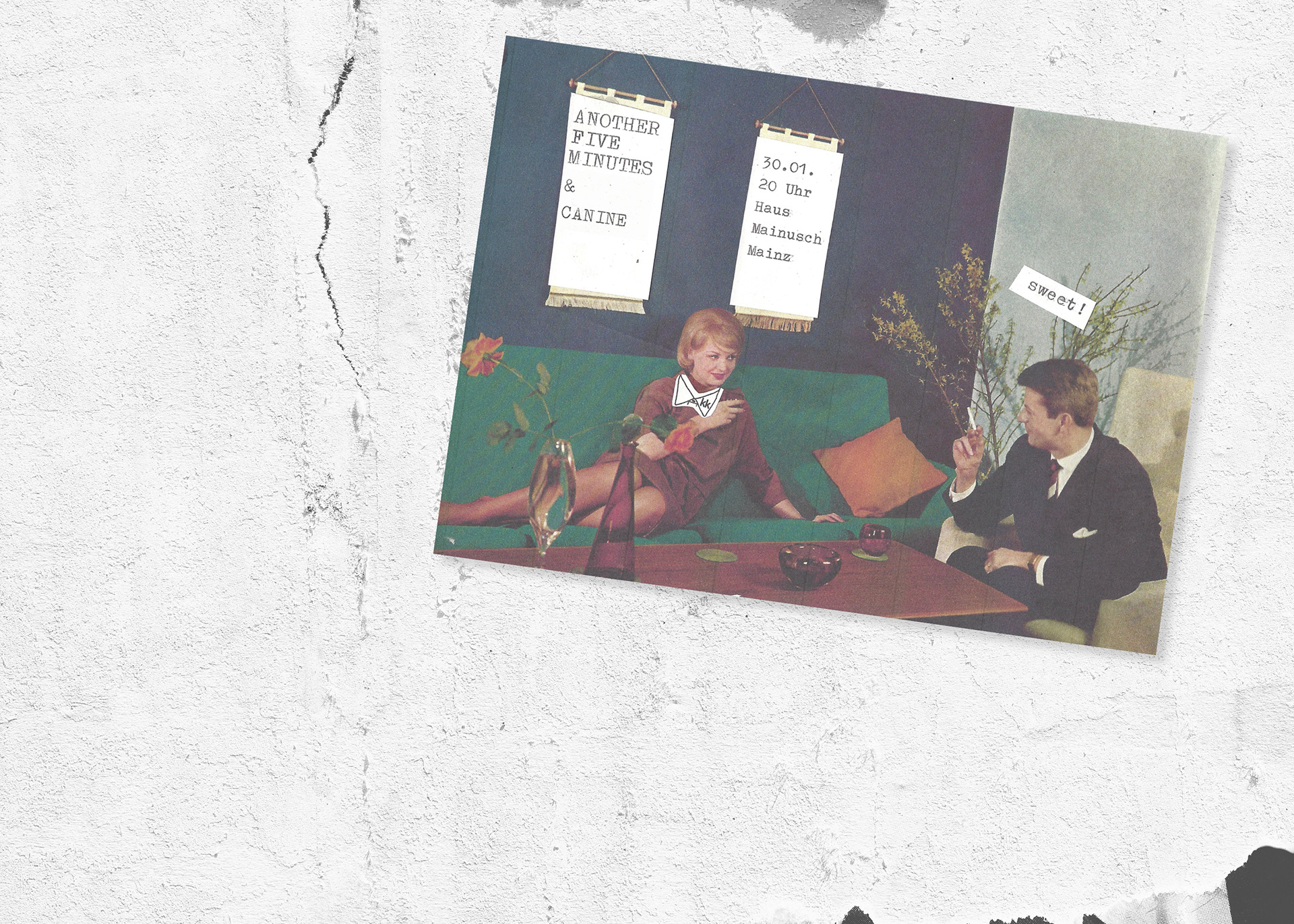
The collar becomes the Logotype which the people printed on flyers, posters and in postings get dressed in paper cut style.